This is useful for those who multiple report and wish to see what is trending. On the [Compare Samples to Each Other] page
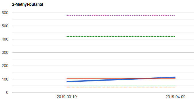
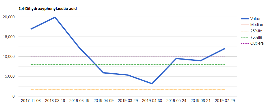
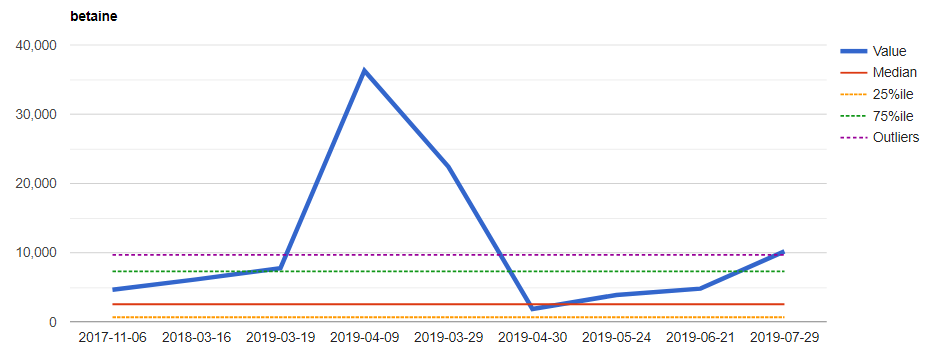
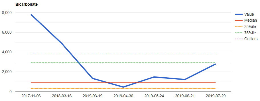
Below I have all of my samples being included and picked a few interesting charts for illustration. The Outlier line is from BoxPlot methodology and when crossed, suggests something may be interesting.