
You may wish to read my prior post here to get a framework for this post. This is intended to get readers to play with the data with some simple canned queries.
There are two ways to view symptom data this
- Classic R (nerd) way – tidying data and dealing with n/a
- Using a prepared CSV file that is ready to go
Classic way
The following lines will create the data.frames to work with
- library(tidyverse)
- symptoms <-read_csv(“http://lassesen.com/ubiome/Symptoms.csv” )
- samplesymptom <-read_csv(“http://lassesen.com/ubiome/SampleSymptom.csv”)
- samplesWithTitle <- inner_join(samplesymptom, symptoms, by=”symptomId”)
This allows some queries but also exposes challenges with converting symptom_names to column names. I will leave things for R-nerds and proceed to the alternative method.
samplesWithTitle %>% group_by(symptomId,symptom_name) %>% summarize(peopleWith=n()) %>% arrange(desc(peopleWith))


Transformed Data
One of my exports addresses the challenges of symptoms names by removing awkward characters such as (‘,:,).
symptoms <-read_csv(“http://lassesen.com/ubiome/SymptomsObservations.csv”)
To see all of the symptom (column) names – a total of 240 of them!
colnames(symptoms)

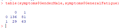
Simple Tables
We can get information about any combination of columns. 1 means true (checked) 0 means false (not checked), for example
One problem is that not everyone gave their gender. To make life easier, we can create a new column, “Sex” with this little bit of code. Note that the values are 1 (TRUE) and 0 (FALSE), so we do not need to write ”
symptoms$GenderMale ==1″, instead just “symptoms$GenderMale”
symptoms$sex = ifelse(symptoms$GenderMale,”M”,ifelse(symptoms$GenderFemale,”F”,”U”))
Now we see things better

We can do the same thing for blood types, i.e.
symptoms$blood_type <- ifelse(symptoms$BloodTypeANegative,”a-“,
ifelse(symptoms$BloodTypeOPositive,”o+”,
ifelse(symptoms$BloodTypeAPositive,”a+”,”U”)))

One of the problems with our data is that often only a few persons provided data. We cannot conclude that only females are o+.
Finding Relationships
Next we are going to look at what groups of symptoms are clustered together. To be more precise — which patients have similar symptoms and thus could be deemed to be a class. This is done by a technique called clustered analysis. This is done by three different method (Complete, Average, Simple). Complete is the recommended approach.
To simplify the code we reload the data and do not add extra columns such as sex or blood type. The lines below computes the normalized distances between every symptoms with each other (240 x 240 computations)
library(tidyverse)
symptoms2 <-read_csv(“http://lassesen.com/ubiome/SymptomsObservations.csv”)
symptoms.scaled <-dist(scale(symptoms2))
Hierarchical Clustering – Complete
We are clustering people with similar symptoms together and end up with three interesting charts. The charts are on the same data but done in different ways. The number shown on the chart is the observation(person) number in our data.
symptoms.complete <-hclust(symptoms.scaled,method=”complete”)
plot(symptoms.complete)

Note that the numbers on the left is the distance that one person is from the next one (shown by the line length).
Patient #47 is sitting by themselves. If you want to see what this person symptoms is, then just enter “str(transpose(symptoms2[47,]))” which will show #47 symptoms (we see that there is a massive number of them – which may be why they are off by themselves)

symptoms.average <-hclust(symptoms.scaled,method=”average”)
plot(symptoms.average, main=”Patients symptoms using average Distance”)

symptoms.single <-hclust(symptoms.scaled,method=”single”)
plot(symptoms.single)

Reader Playground
The above is a high level “how to do it”. If you want to look only at how a certain group of symptoms are clustered, then it is simple, just add the symptoms you have (you can be explicit in the symptoms you don’t have by using “gender__female == 0”
mysymptoms <- filter(symptoms2, GenderMale, GeneralDepression)
dim(mysymptoms)
we see just 24 rows (other people) and 240 symptoms
Now, let us see what are the odds of some other symptoms, for example, brain fog:

We see that 71% (Mean) with the same symptoms have brain fog. In other words, you can get estimated the probability for symptoms that could be coming up.
Bottom Line
There is much that can be done. The above is just a start. In the next post I will build out a model of relationships between symptoms.
