
A few more readers sent in result.
- “P” Bottom 4% for biodiversity (lowest that I have seen)
- “Q” 75% for biodiversity
- “R” 71% for biodiversity
- “S” 78% for biodiversity
Instead of verbal comparison, see the population charts below for a visual of the various bacteria groups!! Oh boy are there huge shifts!!!!
Example Run of Ubiome Reports
After you log in, you have a menu appear.

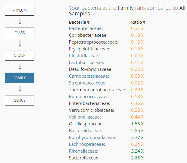
Clicking on Compare take you a display like below that shows the relative amount at different levels.
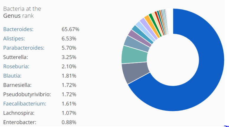
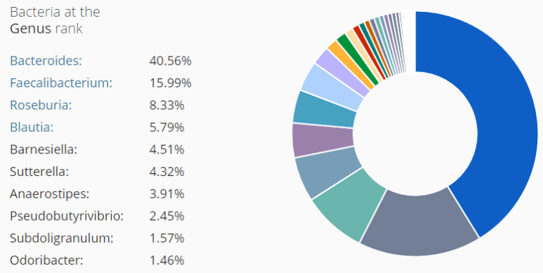
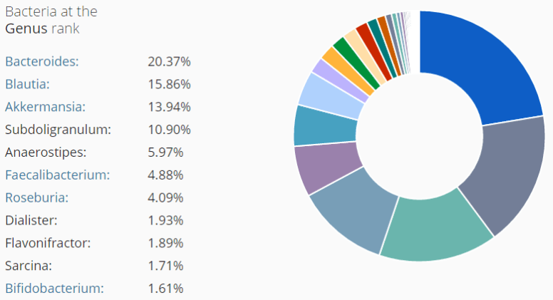
Or you can view it visually by volume (Patient “P”)
Patient “D”
This is from earlier summary, D had IBS only and no CFS
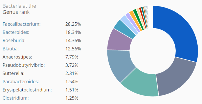
Patient F, CFS only after 20 years

Patient G
Patient J
Latest
A year earlier
Two years earlier
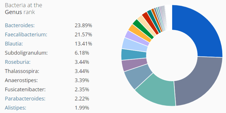
Patient K
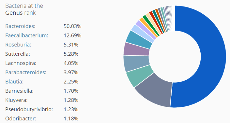
Patient Q
Patient R
Patient S
Bottom Line
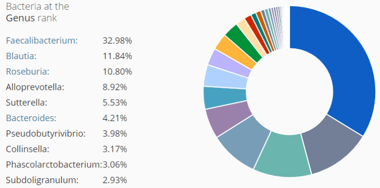
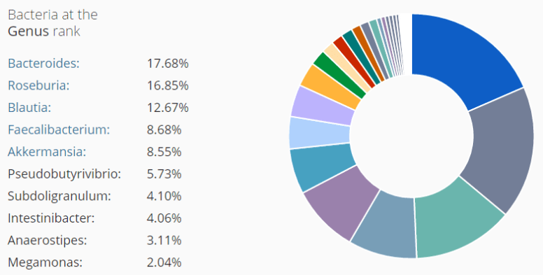
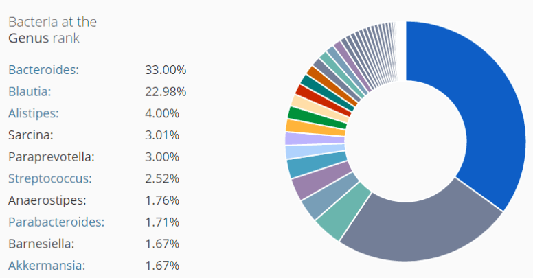
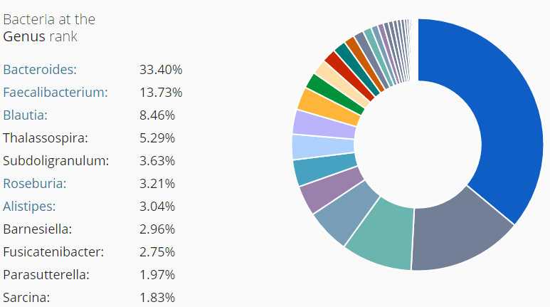
Above you see many different patterns — the shifts are different (and likely match the person symptoms often). “P” is very severe, close to patient J, 2 years earlier (whose profile evolved closer to healthy).
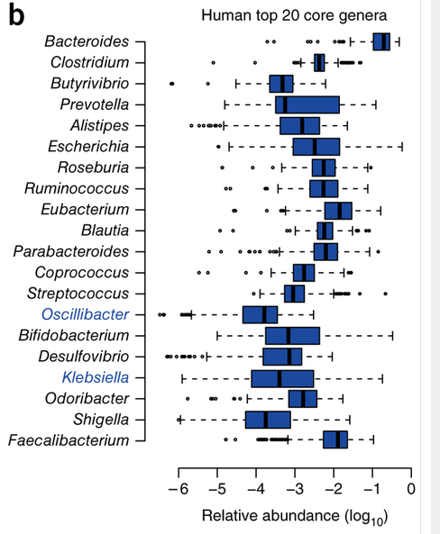
The chart below is from the nature journal[2015]. we have Bacteriodes being the dominate one, nothing comes close!
- We have some patients with greater Faecalibacterium , Kluyvera in 3 of these parents — definitely a massive overgrowth of these groups!
- Faecalibacterium and/or Eubacterium are usually #2… We have three with Blautia being #2. According to the charts, we should not expect more than 1% Blautia
- -1 ==> 10% of population
- -2 ==> 1% of the population
- -3 ==> 0.1 % of the population
What to do?
Most of these bacteria are not available as probiotics. Blautia overgrowth is something that I will research more (because of 3 people having such a high amount). Apart from that, keep to the suggestions of the model. Also, you can see why it is a model — the shifts are not all the same, but the shifts are very noticeable shifts… with the wrong group moving into dominance.
